Archive for the ‘graphic design’ Category

It’s been four years

December 30, 2018

Almost four years ago now my eldest daughter was born and I realised that having a fulltime job and raising a baby (keeping me awake) + doing up your house + working out + drawing would be a bit too much for me. I decided I would stop drawing for some time. Some people didn’t understand my decision but I’d rather go for a run (or BBB/yoga-class 🙂 in the spare personal time I had. Moreover, when I start drawing I tend to constantly think about a certain project and ideas spring to mind at the weirdest times, my baby brain couldn’t handle this.

In those four years we were blessed with two beautiful girls and it was such a pleasure to design the birth announcement cards (of course, raising them was a marvelous journey as well but that’s not what this blog is about). 


Now, almost four years later… we are finally able to sleep through the nights most of the time (I’m so scared typing this, I don’t want to jinx it), our house is renovated (or 2/3 of it), I’m working 4/5 and my baby brain is kicking back to life, I’ve picked up drawing again and I’m superexcited about it!  

At the moment, I’m designing a birth announcement card for a very dear friend of mine, but that’s all I can tell for the time being.


Oorlogsdagen

September 17, 2013

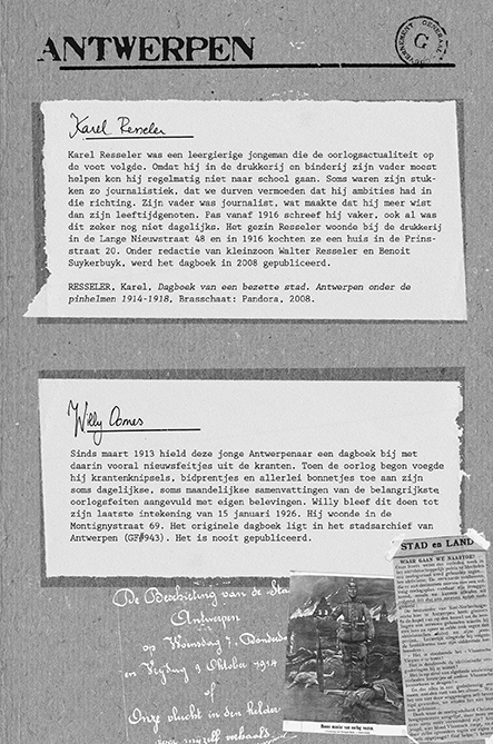
Het voorbije jaar werkte ik aan een illustratiebijlage voor Oorlogsdagen en eindelijk mag ik een tipje van de sluier lichten.

Het leven van de soldaten aan de frontlijn in Vlaanderen tijdens de Eerste Wereldoorlog is genoegzaam bekend. In Oorlogsdagen laat Historicus Pieter Serrien de minder bekende ooggetuigen aan het woord, zij die als gewone burgers aan de bezette kant van Vlaanderen leefden.

Oorlogsdagen vertelt het verhaal van 32 dagboekschrijvers. Het was mijn opdracht om hun afkomst en hun reis visueel weer te geven. Ook de vele oude foto’s en afbeeldingen van originele handschriften zouden hun verdiende plaats krijgen in de extra katern.

Het was een hele uitdaging om de veelheid aan informatie mooi te kaderen en bij al dit digitale werk toch de handmatige look and feel van een dagboek niet te verliezen. Ik moest op zoek naar het juiste evenwicht tussen tussen leesbaarheid en illustratie.
Daarom heb ik gewerkt met de echte texturen van de dagboeken, heb ik zelf de stempels van de verschillende bezettingsgebieden gesneden en ook handmatige typo kreeg zijn plaats.

Ik ben erg benieuwd naar het resultaat dat binnenkort in de winkels zal liggen. Hier kunnen jullie al twee kaarten bekijken.

oorlogsdagenantwerpen

oorlogsdagenantwerpeninfofiche

oorlogsdagen_loon

oorlogsdagenlooninfofiche

spotted: Jean Jullien

January 27, 2013

I spotted Jean Jullien through the Creative Review blog the other day.

On his website he has the cleverest video presenting himself

Jean Jullien is a French graphic designer living and working in London. He comes from Nantes and did a graphic design degree in Quimper before coming to London. He graduated from Central Saint Martins in 2008 and from the Royal College of Art in 2010. He works closely with the musician Niwouinwouin. His practice ranges from Illustration to photography, video, costumes, installations, books, posters and clothing to create a coherent yet eclectic body of work.

‘Jullien is a talented observational artist, deftly summing up the particulars of modern technology and how it affects how we interact with each other – from the way that smart phones have become part of our lives (or ours theirs), to the rise of the self-service till at the supermarket.’ (From Creative Review)

fun_people450_0selfservice569_0
never_alone3_0


Now these are christmas and NY’s postcards I do like.

christmas10web
2
tattooweb

Van Bavel shopping bag

December 5, 2012


IMG_1361

photo


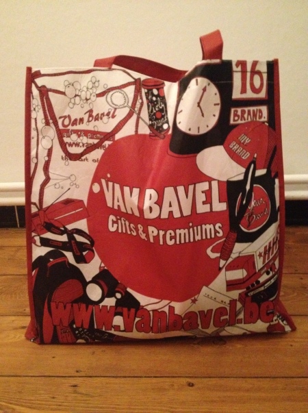
Such a pleasure to see my design come alive!
This is the shopping bag I designed for Van Bavel gifts & premiums.
I’m very grateful for this opportunity, 5000 people can go shopping with this bag now.

zakvanbaveldefweb

design cover Faro magazine

May 16, 2012

I’ve recently designed the cover for a magazine published by Faro (Vlaams steunpunt voor cultureel erfgoed).
The magazine features an article written by my father: ‘A framework of reference for intercultural competence. From intercultural project to social adaptation.’

My family seems to be an expert in handing me jobs with impossibly long and incomprehensible titles.
Remember Peter’s PhD? ‘Expert performance in association football refereeing: the acquisition and fine-tuning of perceptual-cognitive skills in offside decision making.’ I still don’t get what it was about, anyway, but the result can still be seen here.

The topics they write about also don’t seem to be the easiest to illustrate: football and offside training on the one hand and intercultural communication on the other hand? But interesting themes, nonetheless. How do you illustrate ‘intercultural competence’ using one image that should appeal to a public wanting to read Faro’s magazine?

Here’s the full design: front and back (folded)

I hope I managed somehow. I used the tower of Babel as inspiration. The different styles of buildings (there’s a Greek temple, the Pantheon, an American flat  and a Hundertwasser amongst others) represent the different cultures. Such a city is oviously filled with intercultural competent people 🙂 and from one of the windows we get to understand what it means to be interculturally competent according to the assessment criteria my father designed.

Here are some preliminary studies:

spotted while snowboarding: snowboard and skate graphics

April 25, 2011

Travis Millard: American illustrator –  http://www.fudgefactorycomics.com/

mcbess: American illustrator – http://www.mcbess.com/

Ed Templeton: American illustrator and legendary skater

Sean Cliver: skateboard artist – author A history of skateboard art

amaia arrazola: Spanish illustrator and designer (website)

Jeremy Fish (http://www.sillypinkbunnies.com)

Don Pendleton (http://elephont.com/)

Peter’s PhD on football!

May 22, 2010

Peter: “Jane, could you design the cover for my PhD on football?”
Jane: “On football?”
Peter: “Uhu. Actually the full title is: Expert Performance in Association Football Refereeing: the Fine-Tuning of Perceptual-Cognitive Skills in Offside decision making.”

That’s what my brother asked me in February. And I had only two weeks to come up with something.
And I didn’t even know what offside was! What I did know is that nearly all the designs of published doctorates are awfully ugly. (Not hard to imagine if you see the length of the titles!)
In a nutshell, it was quite a challenge. As was the PhD for my brother, I suppose. He defended the thesis yesterday in front of friends, family, colleagues and very scary people in big, black, impressive robes.
I was very glad not to be in his shoes, my work was done!

I must say, it was not unpleasant to see all those smart people walking around with my design in their hands.
The drawing of the assistant referee (I know what they’re called now, I even know what offside is now) is done with drawing ink.